---
title: Component Guide
description: Learn more about the widget component in Homepage, and how to build your widget UI.
---
Homepage widgets are built using React components. These components are responsible for fetching data from the API and rendering the widget UI. Homepage provides a set of hooks and utilities to help you build your widget component.
## A Basic Widget Component
Here is an example of a basic widget component:
```js
import { useTranslation } from "next-i18next";
import Container from "components/services/widget/container";
import Block from "components/services/widget/block";
import useWidgetAPI from "utils/proxy/use-widget-api";
export default function Component({ service }) {
const { t } = useTranslation();
const { widget } = service;
const { data, error } = useWidgetAPI(widget, "info");
if (error) {
return ;
}
if (!data) {
return (
);
}
return (
);
}
```
### Breakdown
We'll cover two sections of the widget component: hooks and components.
#### Hooks
**`useTranslation`**
This hook is used to translate text and numerical content in widgets. Homepage provides a set of helpers to help you localize your widgets. You can learn more about translations in the [Translations Guide](translations.md).
**`useWidgetAPI`**
This hook is used to fetch data from the API. We cover this hook in more detail in the [API Guide](api.md).
#### Components
Homepage provides a set of components to help you build your widget UI. These components are designed to provide a consistent layout, and all widgets are expected to use these components.
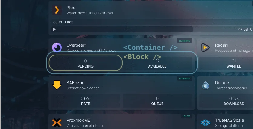
**``**
This component is a wrapper for the widget. It provides a consistent layout for all widgets.
```js
```
`service` is a prop that is passed to the widget component. It contains information about the service that the widget is displaying.
If there is an error fetching data from the API, the `error` prop can be passed to the `Container` component.
```js
```
**``**
This component is used to display a key-value pair. It takes a label and value as props.
```js
```
The `label` prop is used to look up the translation key in the translation files. The `value` prop is used to display the value of the block. To learn more about translations, please refer to the [Translations Guide](translations.md).
If there is no data available, the `Block` component can be used to display a placeholder layout.
```js
```